Fall Into Branding: Essential Colors to Integrate for Fall Campaigns
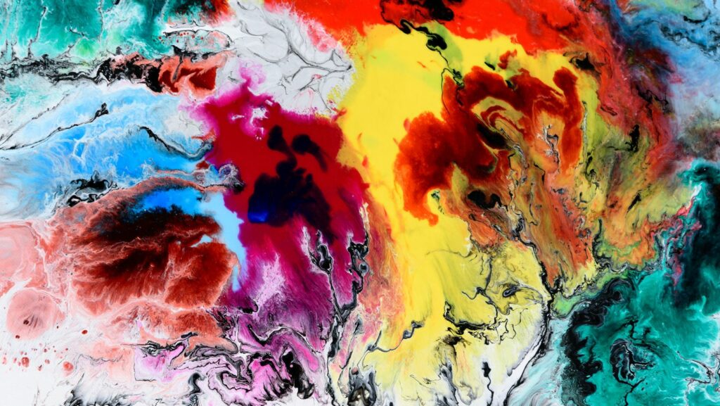
Fall is the season of change when nature dons a vibrant palette, and the air turns crisp. For businesses, this period offers a refreshing opportunity to align branding strategies with the aesthetics of the season.
Capturing the colors of fall can inject a sense of warmth and relatability into your campaigns, making them more effective and memorable.
Understanding which shades resonate with your audience during this season can give your branding efforts a significant edge. Whether you’re using an AI logo creator or launching new ads, here are some essential colors to consider integrating into your fall campaigns.
Burnt Orange: Warmth And Vibrancy
When you think of fall, burnt orange likely comes to mind first. Reminiscent of pumpkin patches, fallen leaves, and crackling fires, this color exudes warmth and comfort. It’s not just about the hue — it’s about the emotions it evokes.
Burnt orange is versatile, working both as a bold primary color or a subtle accent in your designs. From a cozy fall apparel launch or to a limited-time autumn offer, burnt orange can be a captivating choice that resonates with the feelings of the season.
Deep Red: Elegance And Depth
Deep reds, often associated with apples, cranberries, and the later stages of foliage, bring depth and richness to a palette. This color can be especially effective for more upscale or luxury branding strategies. It communicates elegance, maturity, and sophistication.
Consider integrating deep red into promotional materials, product packaging, or even website themes. Paired with gold or cream accents, this hue can elevate the overall perception of your brand.
Golden Yellow: Lively And Invigorating
The golden yellows of fall are symbols of energy, vitality, and harvest. These tones can inject a feeling of positivity and dynamism into your campaigns. If you’re aiming to motivate, inspire, or energize your audience — whether it’s for a fall fitness challenge or a back-to-school promotion — golden yellow is an excellent choice.
Additionally, it’s a color that pairs beautifully with deeper shades, offering a striking contrast that can make your visuals pop. These warm yellows are sure to catch some eyes and keep your brand front of mind on any channel.
Earthy Greens: Balance And Reliability
Fall is not just about the fiery reds and oranges; it’s also a season where earthy greens play a significant role. Think of the pine trees that remain steadfast while other foliage changes or the mossy undertones found in many wooded landscapes. These greens evoke feelings of stability, trustworthiness, and balance.
For brands that want to communicate reliability or eco-friendliness, integrating earthy greens can be a strategic move. This shade can be particularly effective for businesses in the health, wellness, or sustainability sectors.
Muted Browns: Stability And Groundedness
Browns, particularly the muted tones reminiscent of tree bark, acorns, and dry grass, hold a special place in the fall palette. They evoke feelings of groundedness, stability, and nostalgia. Browns can be especially effective in branding that aims to convey trust, heritage, or tradition.
Whether you’re looking to establish or emphasize their long-standing reputation or timeless appeal, muted browns can provide a backdrop of dependability. These tones work wonderfully in backgrounds, typography, or even in product designs to lend a rustic, earthy touch.
Dusky Purples: Mystery And Creativity
Less conventional but equally evocative, dusky purples bring forth the mystique of twilight hours, the transition from warm days to chilly evenings. It’s a color that bridges the vibrancy of summer with the introspection of winter.
Incorporating dusky purples can add an element of surprise and creativity to your branding. It’s ideal for brands aiming to emphasize their innovative approach, artistic endeavors, or those wishing to stand out from the traditional fall colors.

Soft Cream: Neutrality And Flexibility
While autumn is often associated with bold and rich colors, there’s an understated elegance to be found in the softer shades, like cream. Representing the lighter side of fall — think of woolen sweaters or the froth on your pumpkin spice latte — cream offers a neutral, flexible base that can complement and balance out the bolder shades.
Using soft cream in your designs can provide a sense of calm, warmth, and sophistication. For brands that favor minimalist aesthetics or want to introduce fall colors without overwhelming the senses, soft cream offers the perfect solution.
Autumnal Aesthetics: More Than Just a Seasonal Shade
As the golden leaves descend and the season changes, so too should our approach to branding. Fall provides a canvas rich in color, emotion, and symbolism.
By integrating these autumnal hues, brands can craft narratives that resonate deeply, weaving the essence of fall into their very fabric. Remember, every shade tells a story, and this season, let your brand’s story shine with the vibrant tapestry of autumn.


